Note
Go to the end to download the full example code.
Perturbation Correlation Plots
This example demonstrates how to generate a perturbation correlation plot using the
tsunami_ip_utils.perturbations.generate_points()
First we need to cache the base and perturbed cross section libraries that correspond to the SDF profiles that were computed (which for this example is just the dummy 56 group library). This is done by running the following code block:
from tsunami_ip_utils.perturbations import generate_points, cache_all_libraries
from pathlib import Path
from tsunami_ip_utils.viz import perturbation_plot
from paths import EXAMPLES

multigroup_library = EXAMPLES / 'data' / 'dummy_56_v7.1'
perturbation_factors = Path("~/codes/SCALE-6.3.1/data/perturb/56n.v7.1")

cache_all_libraries(multigroup_library, perturbation_factors)
Reading base library...

Caching perturbed libraries:   0%|          | 0/1000 [00:00<?, ?it/s]
Caching perturbed libraries: 100%|██████████| 1000/1000 [00:00<00:00, 13841.49it/s]
Interactive Scatter Plot
More details on caching libraries and why it is necessary are provided in Cache Base and Perturbed Cross Section Libraries. Using these cached libraries, we can now generate the perturbation points for the perturbation correlation plot. Note we specify the number of perturbed points to generate (corresponding to the number of perturbed cross section library samples in the cache directory to use) and the application and experiment SDF files to use for the perturbation correlation plot.
application = EXAMPLES / 'data' / 'example_sdfs' / 'u235-dummy' / 'sphere_model_1.sdf'
experiment  = EXAMPLES / 'data' / 'example_sdfs' / 'u235-dummy' / 'sphere_model_3.sdf'
num_perturbations = 50
points = generate_points(application, experiment, multigroup_library, \
            perturbation_factors, num_perturbations)

fig = perturbation_plot(points, plot_type='interactive_scatter')
fig.show()
Generating perturbation points:   0%|          | 0/50 [00:00<?, ?it/s]
Generating perturbation points: 100%|██████████| 50/50 [00:00<00:00, 1260.39it/s]
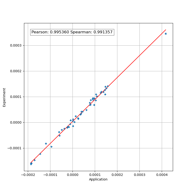
This plot just shows the calcualted Pearson and Spearman correlation coefficients, and does not show the comparison to the TSUNAMI-IP calculated \(c_k\). To generate a comparison like this, please refer to the Matrix Perturbation Correlation Comparison example. Please note that since the Pearson and Spearman correlation coefficients are being computed from a finite sample size, the values necessarily have a sampling distribution with some uncertainty. This uncertainty is generally less than 5% for a sample size greater than 200, but this depends on the value of \(c_k\) (see the technical manual for more details).
The perturbation plot can also be saved as a PNG image using the following code block:
with open( EXAMPLES / '_static' / 'perturbation_plot.png', 'wb' ) as f:
    f.write( fig.to_image('png') )

# sphinx_gallery_thumbnail_path = '../../examples/_static/perturbation_plot.png'
/home/mlouis9/miniconda3/lib/python3.11/site-packages/kaleido/scopes/base.py:188: DeprecationWarning:

setDaemon() is deprecated, set the daemon attribute instead
Matplotlib Scatter Plot
The perturbation plot can also be generated as a matplotlib scatter plot using the following code block:
import matplotlib.pyplot as plt

fig, axs = perturbation_plot(points, plot_type='scatter')
plt.show()

Total running time of the script: (0 minutes 2.342 seconds)