Note
Go to the end to download the full example code.
Contribution Correlation Plots
This example demonstrates the use of the tsunami_ip_utils.viz.viz.correlation_plot() function to generate a contribution
correlation plot.
First, we import the necessary modules, and generate the uncertainty contributions for the desired application and experiment pair (as described in Uncertainty/Variance Contributions).
from tsunami_ip_utils.viz.viz import correlation_plot
from tsunami_ip_utils.integral_indices import get_uncertainty_contributions
from paths import EXAMPLES
import matplotlib.pyplot as plt

application_files = [ EXAMPLES / 'data' / 'example_sdfs' / 'MCT' / f'MIX-COMP-THERM-001-001.sdf' ]
experiment_files = [ EXAMPLES / 'data' / 'example_sdfs' / 'MCT' / f'MIX-COMP-THERM-004-009.sdf' ]

contributions_nuclide, contributions_nuclide_reaction = get_uncertainty_contributions(
    application_files,
    experiment_files,
)
Nuclide-Wise Contributions
Next, we generate the correlation plot using the tsunami_ip_utils.viz.viz.correlation_plot() function. First we start
with the nuclide-wise contributions.
Matplotlib Scatter Plot
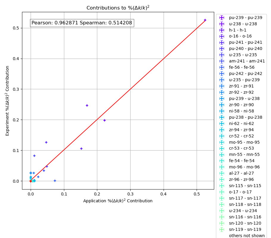
The default plot type of the tsunami_ip_utils.viz.viz.correlation_plot() function is a matplotlib scatter plot.
application_contributions = contributions_nuclide['application'][0]
experiment_contributions  = contributions_nuclide['experiment'][0]
fig, axs = correlation_plot(
    application_contributions,
    experiment_contributions,
    integral_index_name='$\\%(\\Delta k/k)^2$'
)

# Note that the generated figure object is special, and has attributes relating to the regression and correlation coefficients
# that are shown in the plot. These are accessible as follows:
print(fig.statistics)
print(fig.regression)

plt.show()

/home/mlouis9/tsunami_ip_utils/src/tsunami_ip_utils/viz/scatter_plot.py:398: MatplotlibDeprecationWarning:

An artist whose label starts with an underscore was passed to legend(); such artists will no longer be ignored in the future.  To suppress this warning, explicitly filter out such artists, e.g. with `[art for art in artists if not art.get_label().startswith('_')]`.

/home/mlouis9/tsunami_ip_utils/src/tsunami_ip_utils/viz/scatter_plot.py:403: MatplotlibDeprecationWarning:

An artist whose label starts with an underscore was passed to legend(); such artists will no longer be ignored in the future.  To suppress this warning, explicitly filter out such artists, e.g. with `[art for art in artists if not art.get_label().startswith('_')]`.

{'pearson': 0.9628709073353583, 'spearman': 0.5142078670610666}
{'slope': 0.9918790254874091, 'intercept': 0.0021375822330555252}
From the plot you can clearly see the linear regression, the pearson correlation coefficient, and the spearman rank correlation coefficient (more detail given in the technical manual).
Plotly Interactive Scatter Plot
Matplotlib plots are nice for reports, but it’s often useful to be able to interactively explore the data, and see which points
correspond to which nuclides, and see the x and y ordinates of each point. These are all made possible with Plotly plots. To
enable Plotly plots, simply set the plot_type argument to 'interactive_scatter'. Note that now, only a single fig object is
returned, rather than fig and axs objects as in the matplotlib case.
fig = correlation_plot(
    application_contributions,
    experiment_contributions,
    integral_index_name='%(Δk/k)^2', # Note that Plotly plots don't support pylatex in labels, so we just use a plain string
    plot_type='interactive_scatter'
)

# Like before, the generated figure object also has information about the regression and correlation coefficients
print(fig.statistics)
print(fig.regression)

fig.show()
{'pearson': 0.9628709073353583, 'spearman': 0.5142078670610666}
{'slope': 0.9918790254874091, 'intercept': 0.0021375822330555252}
Note that fig.show() starts a local server that serves the web-based Plotly plot (that should pop up in a new browser tab).
Plotly Interactive Scatter Plot with Interactive Legend
The previous plot allows you to toggle the visibility of specific nuclides, but unfortunately doesn’t update the regression
or summary statistics to reflect that change. To do that, you must pass the interactive_legend argument as True.
fig = correlation_plot(
    application_contributions,
    experiment_contributions,
    integral_index_name='%(Δk/k)^2', # Note that Plotly plots don't support pylatex in labels, so we just use a plain string
    plot_type='interactive_scatter',
    interactive_legend=True,
)
fig.show()
Note if you’re viewing this example via the online documentation, the regression and summary statistics interactivity won’t work, because this requires client-side python, and the plots shown above are merely html snapshots. To see the full interactivity, you must run the example locally.
Nuclide-Reaction-Wise Contributions
Next, we generate the correlation plot using the tsunami_ip_utils.viz.viz.correlation_plot() function for the
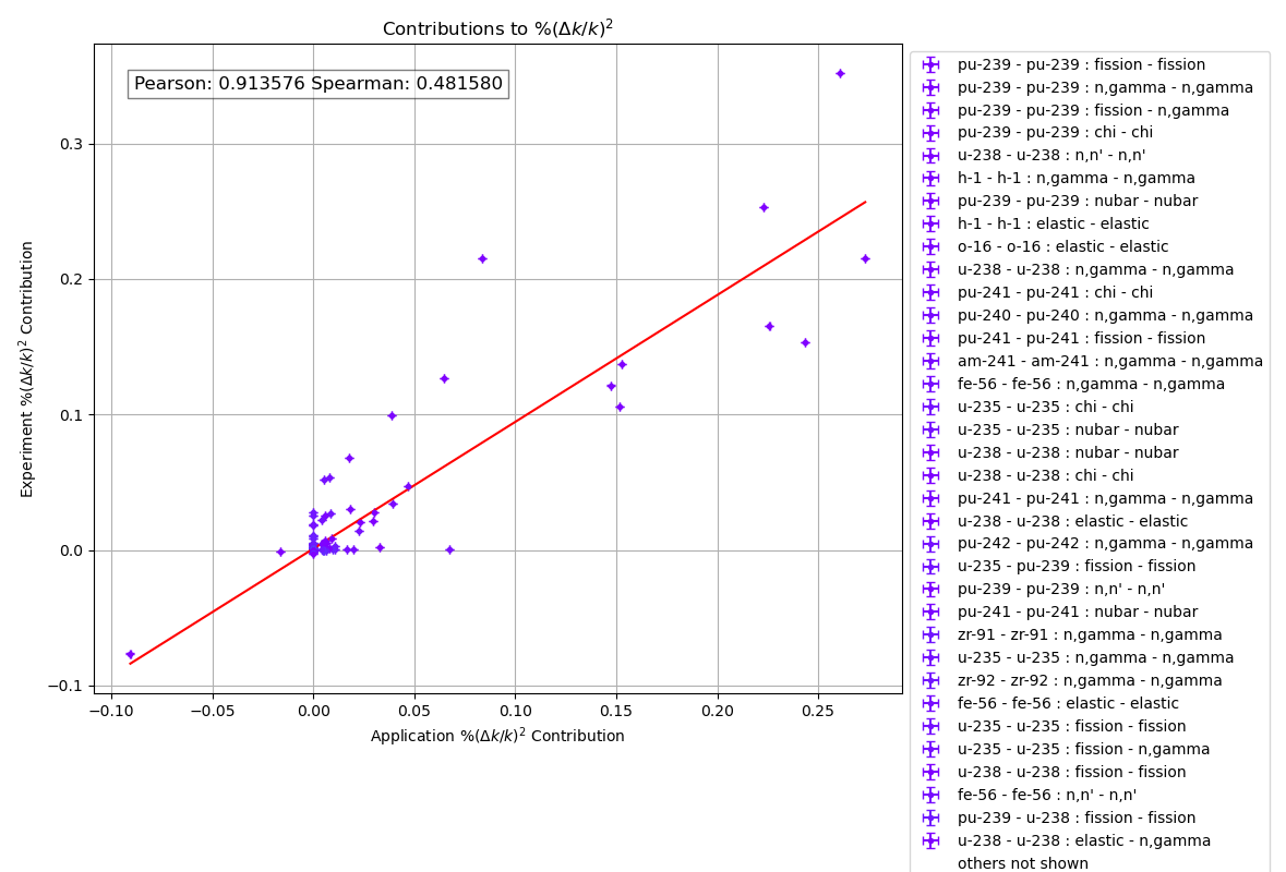
nuclide-reaction-wise contributions. The input is exactly the same, but the contributions are on a nuclide-reaction-wise
basis.
Matplotlib Scatter Plot
application_contributions = contributions_nuclide_reaction['application'][0] # Note that the contributions are nuclide_reaction now
experiment_contributions  = contributions_nuclide_reaction['experiment'][0]
fig, axs = correlation_plot(
    application_contributions,
    experiment_contributions,
    integral_index_name='$\\%(\\Delta k/k)^2$'
)
plt.show()

/home/mlouis9/tsunami_ip_utils/src/tsunami_ip_utils/viz/scatter_plot.py:398: MatplotlibDeprecationWarning:

An artist whose label starts with an underscore was passed to legend(); such artists will no longer be ignored in the future.  To suppress this warning, explicitly filter out such artists, e.g. with `[art for art in artists if not art.get_label().startswith('_')]`.

/home/mlouis9/tsunami_ip_utils/src/tsunami_ip_utils/viz/scatter_plot.py:403: MatplotlibDeprecationWarning:

An artist whose label starts with an underscore was passed to legend(); such artists will no longer be ignored in the future.  To suppress this warning, explicitly filter out such artists, e.g. with `[art for art in artists if not art.get_label().startswith('_')]`.
Plotly Interactive Scatter Plot
fig = correlation_plot(
    application_contributions,
    experiment_contributions,
    integral_index_name='%(Δk/k)^2', # Note that Plotly plots don't support pylatex in labels, so we just use a plain string
    plot_type='interactive_scatter'
)
fig.show()
Plotly Interactive Scatter Plot with Interactive Legend
fig = correlation_plot(
    application_contributions,
    experiment_contributions,
    integral_index_name='%(Δk/k)^2', # Note that Plotly plots don't support pylatex in labels, so we just use a plain string
    plot_type='interactive_scatter',
    interactive_legend=True,
)
fig.show()
Total running time of the script: (0 minutes 13.080 seconds)