Note
Go to the end to download the full example code.
Visualizing Contributions
This example illustrates the use of the various tools for visualizing contributions to a TSUNAMI-IP integral index (such as \(E\), or even contributions to \((\Delta k/k)^2\)). This example shows the visualization of \((\Delta k/k)^2\) contributions, but the same tools can be used for visualizing contributions to \(E\).
Isotope-Wise Contributions
First, we demonstrate the tools for visualizing isotope-wise contributions to the nuclear data induced variance, \((\Delta k/k)^2\). First we need to get the contributions (further details are provided in Uncertainty/Variance Contributions). Note that visualizing the contributions to the nuclear data induced uncertainty with these tools will produce visually misleading plots, as the uncertainty contributions don’t add to the total nuclear data induced uncertainty, so their representation in a pie chart is dubious, and in certain cases causes the reaction-wise plots to have incorrect nuclide-wise totals.
from tsunami_ip_utils.integral_indices import get_uncertainty_contributions
from paths import EXAMPLES

application_filenames = [ f"{EXAMPLES}/data/example_sdfs/MCT/MIX-COMP-THERM-001-001.sdf" ]
uncertainty_contributions_nuclide, uncertainty_contributions_nuclide_reaction = \
      get_uncertainty_contributions(application_filenames, variance=True)
The isotope-wise contributions can be plotted using the tsunami_ip_utils.viz.contribution_plot() function.
This function takes a contribution list and creates a plot of the specified type. First, we must extract a list of
contributions for a specific application from the tsunami_ip_utils.integral_indices.get_uncertainty_contributions()
output.
contributions = uncertainty_contributions_nuclide['application'][0]
Bar Chart
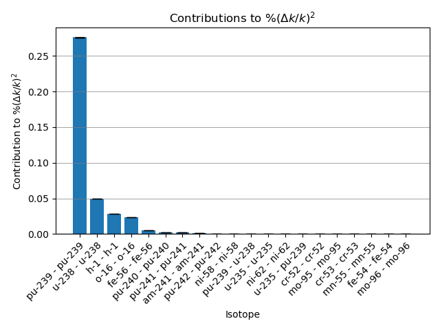
The contributions can then be plotted as a matplotlib bar chart.
from tsunami_ip_utils.viz.viz import contribution_plot
import matplotlib.pyplot as plt

fig, axs = contribution_plot(contributions, plot_type='bar',integral_index_name='$\\%(\\Delta k/k)^2$')
plt.tight_layout()
plt.show()

Pie Chart
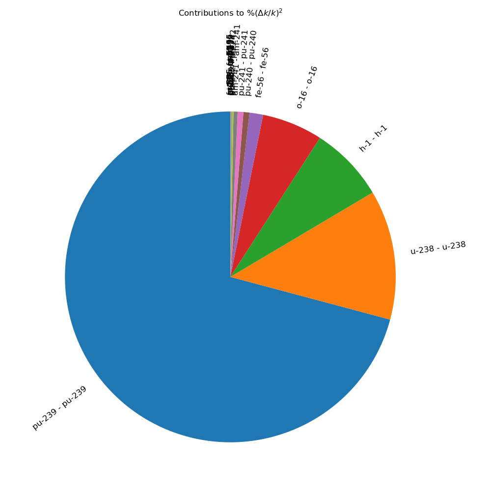
The contributions can also be plotted as a matplotlib pie chart.
fig, axs = contribution_plot(contributions, plot_type='pie',integral_index_name='$\\%(\\Delta k/k)^2$')
plt.tight_layout()
plt.show()

Interactive Pie Chart
The contributions can also be plotted as an interactive plotly pie chart.
fig = contribution_plot(contributions, plot_type='interactive_pie', integral_index_name='%(Δk/k)^2', interactive_legend=False)
fig.show()
Interactive Pie Chart With Interactive Legend
The contributions can also be plotted as an interactive plotly pie chart with an interactive legend. This feature has yet to be formally implemented in Plotly Express (although an issue is open here ).
fig = contribution_plot(contributions, plot_type='interactive_pie', integral_index_name='%(Δk/k)^2', interactive_legend=True)
fig.show()
Note that inner wedges in the pie chart (which may be difficult to select or see manually) can be selected by clicking on the corresponding legend entry. This will highlight the corresponding wedge in the pie chart.
Reaction-Wise Contributions
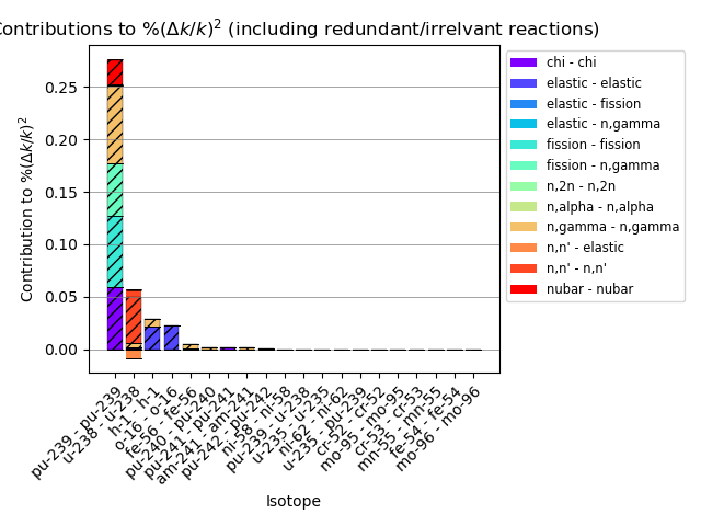
The isotope-reaction-wise contributions can be plotted similarly.
Bar Chart
contributions = uncertainty_contributions_nuclide_reaction['application'][0]

fig, axs = contribution_plot(contributions, plot_type='bar',integral_index_name='$\\%(\\Delta k/k)^2$')
plt.tight_layout()
plt.show()

Note that, in this case, since the reaction wise contributions aren’t strictly positive (the isotope-wise contributions aren’t either for dissimilar nuclides, but this example only contains like nuclide covariances), the bar chart displays negative contributions below the x-axis and positive contributions above the x-axis. Then, to visualize how the positive and negative contributions cancel out, a hatched “effective” contribution box is displayed, which corresponds to the isotope wise contribution.
Pie Chart
fig, axs = contribution_plot(contributions, plot_type='pie',integral_index_name='$\\%(\\Delta k/k)^2$')
plt.tight_layout()
plt.show()

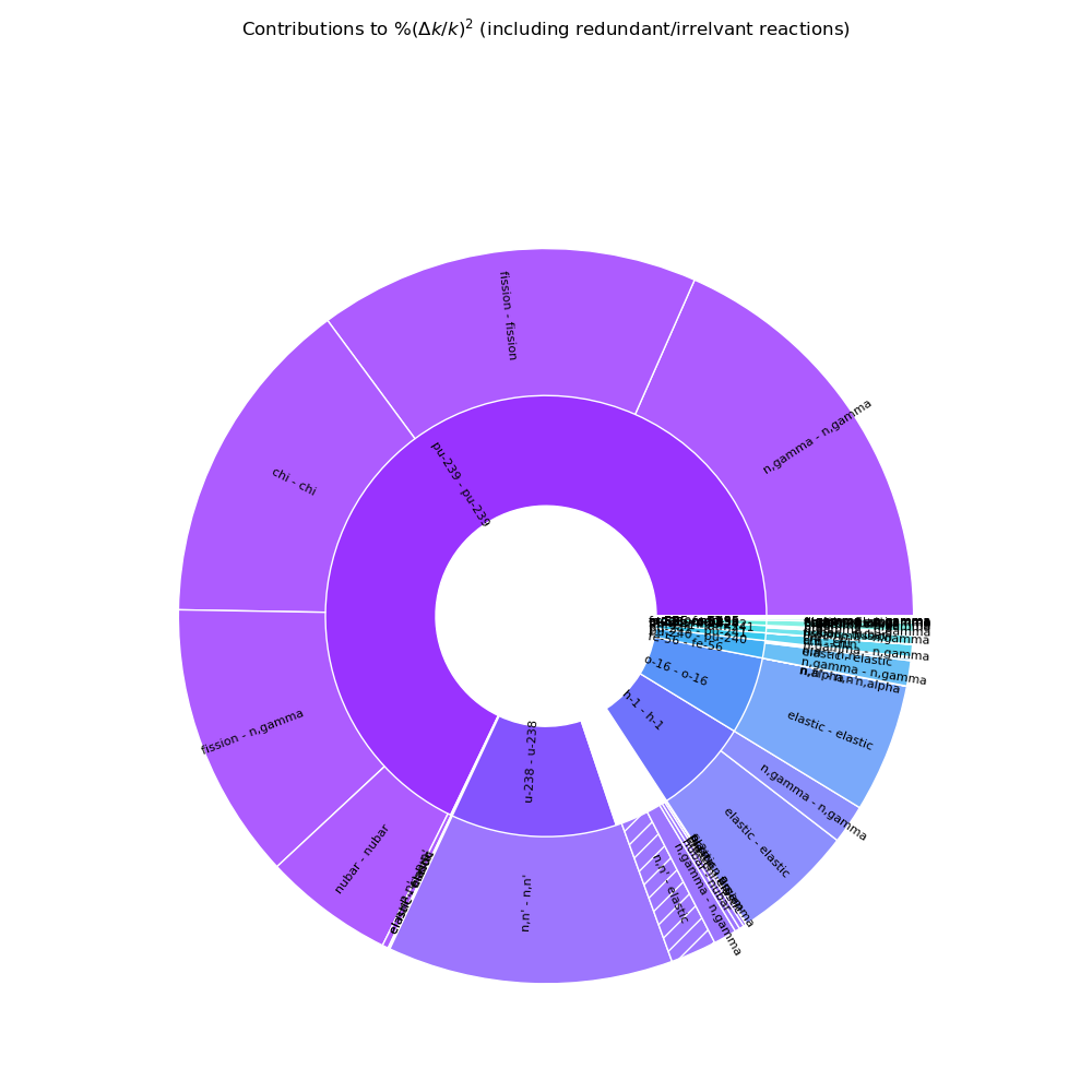
In the pie chart above, you can see that the isotope-wise contributions are on the inner ring, and the reaction-wise contributions are on the outer ring. The negative (reaction-wise) contributions are hatched, and to demonstrate how the positive and negative contributions cancel out, there is white space in the inner ring corresponding to the contribution that was “lost” due to the cancellations.
Interactive Pie Chart
fig = contribution_plot(contributions, plot_type='interactive_pie', integral_index_name='%(Δk/k)^2', interactive_legend=False)
fig.show()
The interactive pie chart (a Plotly Express sunburst chart) takes a different approach than the static (matplotlib) pie chart in the previous section. The contributions are delineated first by nuclide, then within each nuclide, by wether the contribution is positive or negative (these wedges are weighted by the absolute value of the sum of the contributions of the respective sign) and finally by reaction. As with all Plotly Express sunburst charts, clicking on a given wedge will zoom in on that wedge, and clicking on the center will zoom out - easily allowing the user to explore contributions of interest.
Interactive Pie Chart With Interactive Legend
fig = contribution_plot(contributions, plot_type='interactive_pie', integral_index_name='%(Δk/k)^2', interactive_legend=True)
fig.show()
The interactive legend in this case serves more of a purpose, because the legend entries are clickable, and expand the reaction-wise contributions for a specific nuclide. This can be helpful if small contributions are of interest.
Total running time of the script: (0 minutes 12.083 seconds)